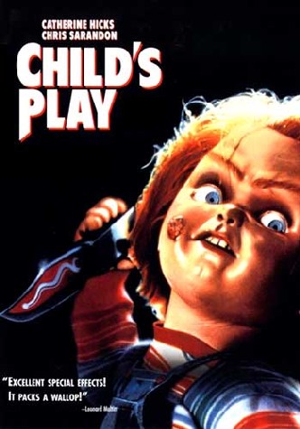
The typography used for the film title of 'Child's Play' is very bold and on its own is none threatening perhaps to give it an innocent appearance much like the name of the film as the title 'Child's Play' does not strike fear into anyone's hearts but instead people feel comfortable with this title. This is effective as it misplaces the audiences trust which leaves them vulnerable to horror elements featured throughout the film.
The actual font its self appears very basic in style with little in terms of stylizing.Any hints of horror we do get from the typography used would be the chosen colour scheme for this title. Th colour scheme is predominately white with orange highlights giving it a 3D effect. However these highlights on top of making the typography appear 3D give of a Halloween feel which in turn gives off a horror vibe, orange being typically associated as one of the distinct colours used for Halloween.
Other fonts used through the film is a typical ariel font in white which doesn't convey much on its own, this font is used for credits, taglines and title cards. This font could of been selected due to its simpleness as it isn't distracting and does not draw your attention from whats happening on screen but at the same time isn't too subtle.
The typography used in the films title does not appear in the opening two minutes of the where as the white text is used to display actors names and other credits throughout the opening.
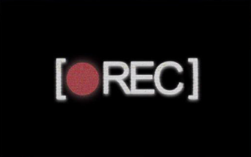
The typography used in the title for the film 'REC' is stylized too look like that of the recording icon on camcorders. The reason as to why this is styled this way is do to the nature of the horror and its camera work, as all the cameraography in this film is meant to be point of view 'found footage'. This style of font only further immerses people in the theme of found footage and how its from a run of the mil camcorder.
The title of the film 'REC' is appropriate for the film due to its theme and how the camera is recording the entire scenario that plays out within the film, 'REC' is appropriate also due to it imitating that of the icon that appears on typical recording devices when they are recording.
Accompanying the titles name and font style would be how they have incorporated punctuation into their title to further project the imitation of the icon, this punctuation comes in the form of two brackets that surround the text.
The films title does not appear within the opening two minutes however much like in 'Child's Play' plain white ariel text is used to reveal the opening credits to the film.
